

Think digital twins are too hard? Not anymore.
Combine map layers, 3D models and live spatial data into accessible digital twins — right in your browser. No installs. No code. Unlimited seats.


Build digital twins in minutes, not months, with Terria
Federate 2D maps, 3D models, and live IoT data into browser-based digital twins.

Create
Spin up a new digital twin project and invite your team. No code, no licensing barriers.
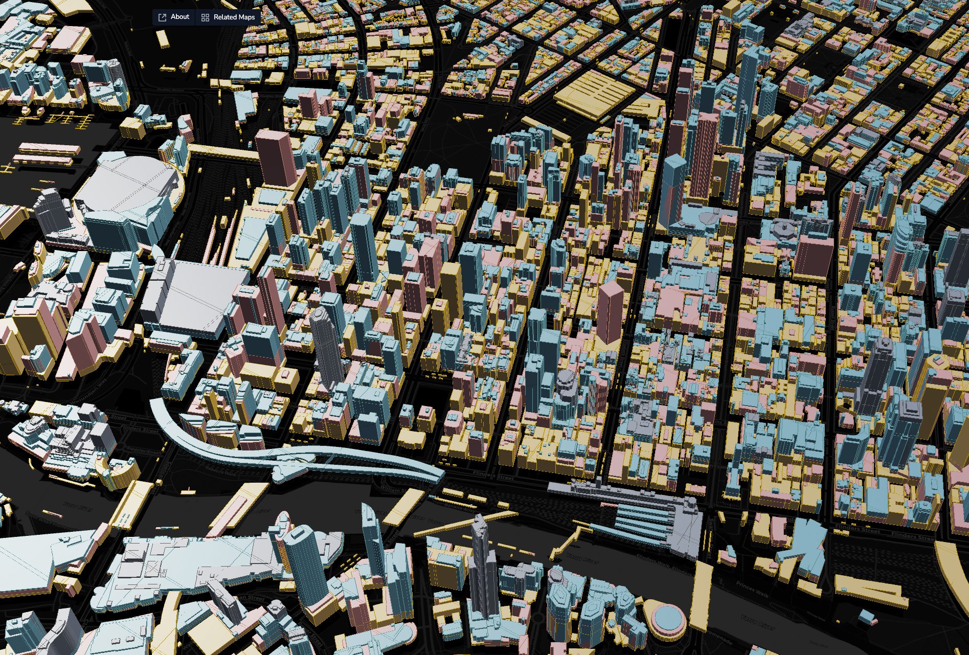
Melbourne Photomesh (February 2025) - Aerometrex

Collaborate
Tell your data story and share your digital twin with a simple URL that anyone can explore.

Connect
Terria supports 60+ formats—2D map layers, 3D models, live data, open and proprietary, plus free-to-use open data from our built-in demo data catalogue.
Melbourne Photomesh (February 2025) - Aerometrex
“The ability to overlay scans, imagery, and system data into one accessible tool is game-changing.”

Cristobal Sierra, Digital Engineer, WT Australia
Extend your existing GIS investments
Federate data from your current systems, amplifying their value with our best-in-class digital twin.
Support for 60+ formats. Connect to nearly any data source—no migration required.
Leverage your legacy systems, proprietary formats, and complex datasets—our team are here to help support data processing into web-ready formats.
Use our built-in data catalogue to add free, useful data layers to your existing analyses.

Cocos Islands Contours 0.5m – 2011. © Geoscience Australia, 2019. Licensed under CC BY 4.0.

Support organisation-wide spatial collaboration
Align everyone around a single source of truth
Give unlimited users access to your 3D datasets, LiDAR, and IoT feeds without per-seat restrictions.
No installations or plugins required for anyone. Works in any browser and provides a modern user experience.
No GIS expertise or specialised software needed. Transport, environment, planning, and infrastructure teams can all explore the same digital twin.
Experience web-native digital twins
Full-featured digital twins designed for browser performance and accessibility.
Built on CesiumJS for top-of-class 3D performance. See projects in real-world context with terrain and infrastructure.
2D and 3D, open and proprietary, Terria brings it all together into one, web-accessible visualization.
Integrate live sensor data, API feeds, and IoT streams with static data for dynamic digital twins that reflect current conditions.
“What really stood out was how easily people could engage — whether they were technical or not. Government and community stakeholders didn’t need to read complex maps. They could just see it.”
Jonathan Gray, Senior GIS Consultant, CNC Project Management
More about Terria

Learn how Tokyo Metropolitan Government is using Terria to unify its sprawling urban information.

Terria CXO Amber Standley on the future of digital twins and spatial tech.
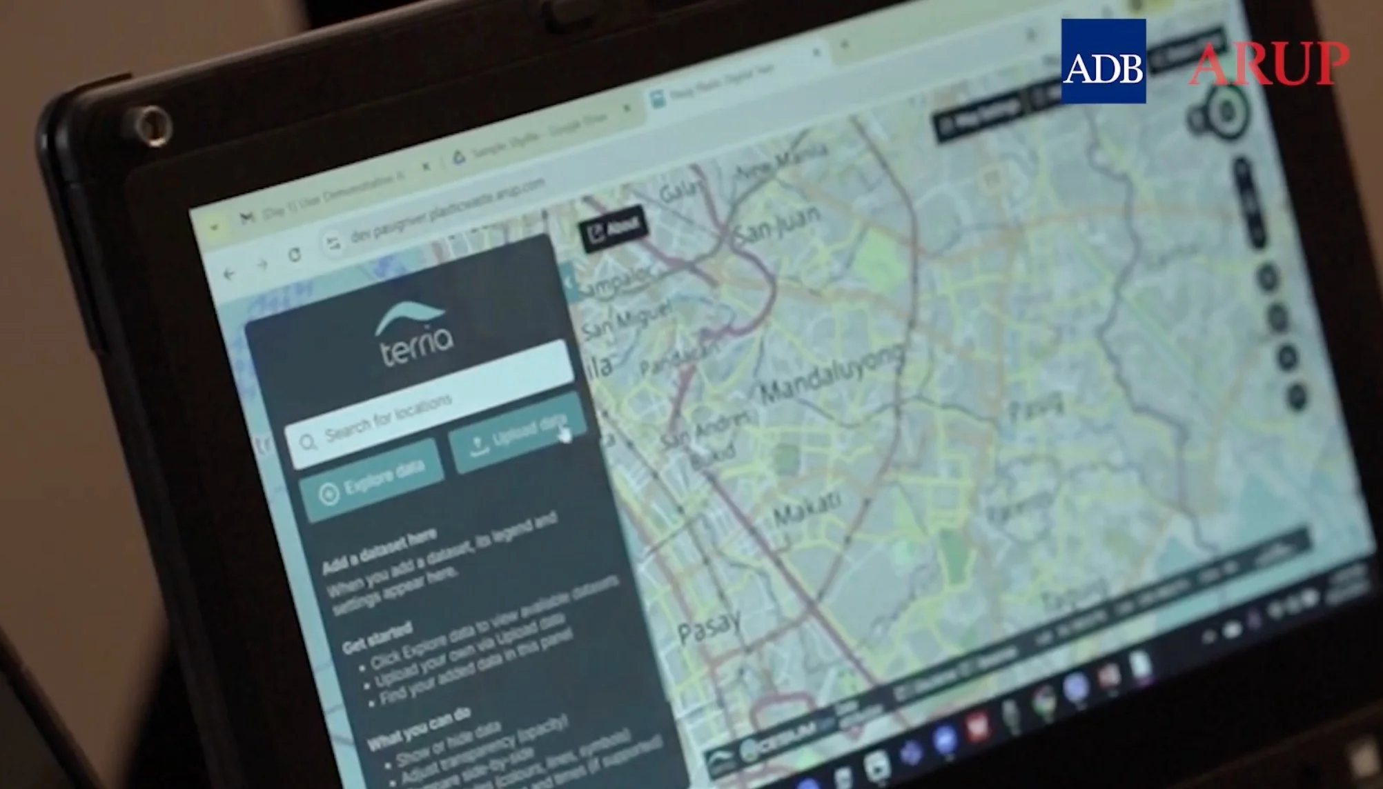
Learn how Arup used Terria to model river flow and identify plastic waste hotspots, helping restore the Pasig River.
Take your spatial project to the next dimension
See how teams like yours are building digital twins that engage stakeholders and accelerate decisions.